Changing an Icon

To find out how to change any icon along the top of the HTML5 reader, either watch the support video below or follow the steps at the bottom of the page.

We hope you found this video useful, if not please contact our support team via the form at the bottom of this page.

Step by Step Guide: Changing an Icon

Within the HTML5 reader, every single icon along the top bar is customisable to match your company branding.

To do this you must initially access the publication you wish to customise.

Then access the publication settings and click on the Top Bar tab.

You will then be able to see the options for Icons and Desktop Icons.

When you expand these headings you will see all of the icons that are available to customisable.

If you already have your image hosted elsewhere, you can directly drop in the URL for that new button.

Alternatively, you can upload your media to PageSuite.  After clicking the upload button you will be able to browse your files and select the file you would like to use for the icon.

After the image has been uploaded, click on the one you would like to use, it will turn blue and then click the green ok button.

If you hover over the image you will see a preview appear in the middle of the screen.

After these steps have been completed, scroll to the bottom of the page and click save.

You will notice underneath every icon it shows a recommended size to use, this 64×64 pixels.

Advertising Overview

To find out what advertising options are available and how to add them into your HTML5 publication, either watch the support video below or follow the steps at the bottom of the page.

We hope you found this video useful, if not please contact our support team via the form at the bottom of this page.

Step by Step Guide: Adding Advertising

After logging into the PageSuite portal, click on the publications tab then select view publications.

Find the publication you would like to add advertising to and click on Publication Settings, then the advertising tab.

It will now display all the different types of advertising that can be added into the publication.

If it’s not checked already, check the “Adverts Enabled” checkbox which can be found on the “Adverts” tab. enabling-adverts-1

It will now display all the different types of advertising that can be added into the publication.

Options to turn on each different type of advert will appear. Check the “Enable” checkbox next to the advert you wish to switch on. N.B. Article Popover Ads are enabled in the article templates.
enabling-adverts-2Options to select the advert type will appear. You can only select one type for each advert.enabling-adverts-3

Depending on which advert type you have selected; a series of options will appear. You must complete all required options before you’ll be able to save.

enabling-adverts-4

Or…

enabling-adverts-5

Or…

enabling-adverts-6

After completing the required fields click the “Save” button at the bottom of the page.

enabling-adverts-7

If you need to know the required advertising and branding dimensions click here.

HTML5 Reader Specification

Below you will find all of the latest specifications relating to branding and advertising opportunities in the new reader.  You can also download our  Advert Options PDF here (98KB).

Reader Branding Asset Sizes

Banner Advert Sizes

Interstitial Advert Sizes

Reader Advert Sizes

Article View Advert Sizes


Reader Branding Asset Sizes

reader branding sizes

Asset Desktop Tablet Mobile
Splash Screen Logo 1200 x 1200 600 x 600
Reader Logo 465 x 64 48 x 48
Reader Background 2048 x 1536 None None
Custom Icons 64 x 64

Notes

  • All Dimensions in pixels (px). 72 ppi
  • Recommended format for logos and icons: Transparent PNG
  • Splash screen logo can be supplied as an animated GIF

Banner Advert Sizes

advert banner sizes


Asset Desktop Tablet Mobile
Splash Screen Banner 728 x 90 728 x 90 320 x 50
Reader Banner 728 x 90 728 x 90 320 x 50

Notes

  • All dimensions in pixels (px). 72 ppi
  • DFP or image format (PNG or JPEG)

Interstitial Adverts Sizes

advert interstitials sizes

Asset Desktop Tablet Mobile
Portrait Interstitial 1024 x 768 768 x 1024 320 x 480
Landscape Interstitial 1024 x 768 1024 x 768 480 x 320

Notes

  • All Dimensions in pixels (px). 72 ppi
  • DFP or image format (PNG or JPEG)

Reader Advert Sizes

advert interstitials sizes

Asset Desktop Tablet Mobile
Left-hand Ad (Page 0) 768 x 1024 None None
Reader Wrapper 150 x 150 None None
Menu Ad 240 x 40 240 x 40 240 x 40

Notes

  • All Dimensions in pixels (px). 72 ppi
  • Recommended format: JPEG or PNG

Article View Advert Sizes

advert interstitials sizes

Asset Desktop Tablet Mobile
Article Banner 728 x 90 728 x 90 320 x 50
Article MPU 300 x 250 300 x 250 300 x 250

Notes

  • All Dimensions in pixels (px). 72 ppi
  • DFP or image format: (PNG or JPEG)

Adding Analytics

This video shows you how to add analytics into your digital edition.

We hope you found this video useful, if not please contact our support team via the form below.

Adding an RSS Feed

This video shows you how to add an RSS Feed into your digital edition.

We hope this video helps, if not please contact our support team via the form below.

Article Tool – User Guide

Click on the below headings to jump to a certain section:

Accessing the Article Tool
Navigating the Edition Preview
Creating a New Article Link
Editing an Article Link
Deleting an Article Link

Accessing the Article Tool

  1. Firstly log into portal.pagesuite.com
  2. Click the “Publications” option.
  3. Hover over the desired publication and select “List Editions”
  4. Use the months listed on the left to find the desired edition.
  5. Hover over the desired edition and select “Manage”
  6. Select “Articles”.

Navigating the Edition Preview

This navigation bar enables you to access the different pages of the edition and zoom in and out.

Sections Option

This area allows you to set-up content sections within the edition. For the best experience setting up content sections, use the “Contents List Manager” instead of the article tool.

Pages Button

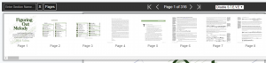
Clicking the below “Pages” button opens an overlay box displaying previews of all the pages within the edition. Click on any of these previews to jump to that page.

First/Previous/Next/Last Buttons

You can use these buttons to move through the pages within the edition, or jump to the first and last pages.


This toolbar also shows you the current page you are viewing. By clicking on it you will open up the same overlay that appears when you click the pages button. You can then jump to a particular page by clicking on its preview.

S.T.E.V.E Drop-down

This drop-down allows you to turn on PageSuite’s automatic text-block recognition system. Selecting “Enable S.T.E.V.E” will generate boxes around the text it detects, which you can use to build articles.

Zoom Controls

Clicking the “-“ icon will zoom out of the page and clicking the “+” will zoom in.

Firstly click the “New Link Button”

Creating a Headline

Then click the “Enter headline” text-box, once clicked it will be outlined in yellow.

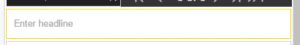
Next hold and drag on the edition preview, and draw a box around the headline.

This should then auto-populate the headline text-box with the content you’ve just highlighted. Ensure that the content is correct and edit it if necessary. You can also enter the Headline manually if you wish.

Creating a Sub-Headline and a Byline

To create a sub-headline and a ByLine repeat the previous steps, but under the sub-heading section.

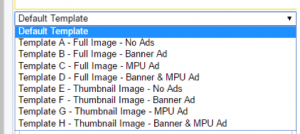
Selecting a Template

Select your desired template. Templates control the size of images and whether articles are included.

Creating the Main Article Content

To edit the main content of the article you can select the text box, drag a box around the content on the page and it will auto-populate, the same way you do with the headline, sub-headline and byline.

You can then add the contents of several boxes on the page to this text box, just ensure the cursor is in the correct place when you draw the second box. Alternatively, you can enter it manually.

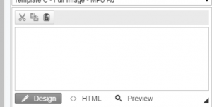
To help make editing easier, there are three buttons above the text box that use your computer’s clipboard:

  1. Cut
  2. Copy
  3. Paste

There are also three mode buttons below the text-box:

Design – This mode is the basic mode for editing in.

HTML – This mode shows the HTML tags in your content for advanced editing.

Preview – This mode disables the cut, copy and paste buttons and prevents editing. It is ideal for proof-reading text to prevent accidental edits.

Adding and Removing Link-Areas from the Page

If you would like to add a link-area but not import it as content into any of the article content areas, you can click the “Add Link” option before drawing your box.

To remove a link-area you have associated with this article (highlighted on the page in yellow), hover over the corresponding tag to highlight the area in orange. You can then click the “x” on the tag and it will remove this link-area.

Adding Images & Captions to Articles

You can include images into the articles by following the below steps:

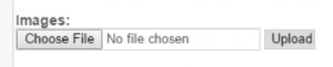
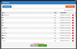
If you want to upload a new image first click the “Choose File” button

Next, select the image you would like to upload from your computer in the pop-up window.

Then clicks Open to close that pop-up and finally click the “Upload” button next to the image name.

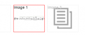
A pale, thumbnail of the image should appear at the bottom of the panel. Click it so it’s no longer paled-out and has a red border. This image is now included in the article.

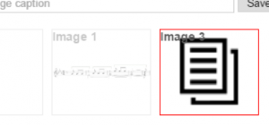
The article tool may also detect any images on that page and have them as an option. Simply click on the pale thumbnail so it’s no longer pale and so it has a red border.

If you wish to add captions to any of your images, first make sure that the thumbnails of the images you are including in the article are highlighted.

Select the name of the image from the drop-down.

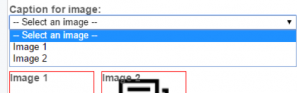
Then type your caption into the text-box below from the dropdown.

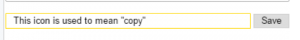
Press the grey “Save” Button next to where you entered the caption.
N.B. This is only saving the caption to the image, it is not saving the article.

Saving your Article or Leaving the Edit Screen

When you are happy with your newly created article you can save it. Either click the blue “Save” button to save the article and return to the list of articles.

Alternatively, you can click the blue “Save and Create” button, this saves your current article and refreshes the fields so you can start making another new article straight away.

If you didn’t want to create a new article, you can return to the list of articles by clicking the green “Cancel” button.

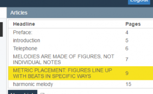
Firstly make sure you’re not currently creating or editing an article. Select the title of the article you want to edit from the list of articles by clicking on it.

Saving or Leaving the Article Editor

To save the changes made to the article and return to the article list view, click the blue “Save” button.

To return to the article list view without saving your changes, click the green “Cancel” button. This will revert the article to the last saved version.

If you’re currently editing the article you want to delete, skip to step 2, else: make sure you’re not currently creating or editing an article. Select the title of the article you want to delete from the list of articles by clicking on it.

You are now editing the article, from here you can delete it by clicking the red “Delete” button at the bottom of the editor panel. This will remove the article and return you to the article list view.

If you would like to see a video of the article extraction tool, click here.

If you would like any further information on the article tool, please use the support form below and we will be happy to assist.

Using the Text Extraction Tool

This video shows you how to use the text extraction tool to create pop-out articles with the HTML5 reader.

We hope you found this video useful, if not please contact our support team via the form below.

Social Sharing

To find out how to share via social media within the HTML5 reader, either watch the support video below or follow the steps at the bottom of the page.

We hope you found this video useful, if not please contact our support team via the form at the bottom of this page.

Step by Step Guide: Enabling Social Media & Sharing Via Social Media

You can access the sharing options within the edition in a couple of different ways.

1. Via the top menu bar

2. Or the menu accessed on the right-hand side

It is worth noting when the edition is open the whole edition will be shared. However, if you are in the article view it will only share that selected article.

Enabling Sharing

To do this you must initially find the publication you want to enable sharing for.

Then hover over the publication and click on publication settings.

Finally, select the sharing tab.

If sharing isn’t enabled check the box, you can then pick and choose what social networks you would like to have available for readers.

Reaching the Splash Screen Settings Page

Note: The PageSuite Portal is optimised for large desktop devices using the Chrome browser.

1. Log in to portal.pagesuite.com

2. Click “Publications”

3. Click “Edit Publication Settings” on your desired publication

4. Ensure “HTML5 Reader” is switched on and that you’re in that section.

5. Click the “Splash Screen” tab. The top of your page should look something like this: 

6. Further information on any setting can be found by hovering the cursor over the blue question mark next to it.

If you would like to find out how to edit the splash screen settings, click here.

Editing Splash Screen Settings

In order to edit splash screen settings, you must enable the splash screen by checking the “Enable Splash Screen” checkbox on the Splash Screen settings page.

When this is checked, you will be given the following options:

  1. Minimum Duration Here you can enter the minimum time (in seconds) that the splash screen should appear for.

  1. Background Colour in Chrome (and a few other web browsers) you will get a colour swatch next to a textbox.

Clicking this swatch will open up a colour picker similar to this:

Alternatively, you can enter the hex code for your desired colour. N.B. if you’re using a browser that does not support this colour picker you can use http://www.colorpicker.com/

  1. High Res Logo

This setting allows you to have a high-resolution custom logo appearing on the splash-screen. High resolution means a large image: we recommend a size of 1200 pixels by 1200 pixels. It has several parts to it:

a. A textbox – Here you can enter a URL (web address) of an image, alternatively selecting a file from one of the following parts will populate this textbox for you.

b. Upload Button – Clicking this opens up a modal (pop-up) where you can select from previously uploaded images or upload a new one.

c. Drop Down – This dropdown will contain a list of any image assets associated with your portal account. Click an option to select that image.

Hovering your cursor on the image preview will display a full-size preview of the image.

  1. Small Logo This setting has several parts to it (see High Res Logo). It allows you to have a smaller logo on smaller screens, we recommend a size of 600 pixels by 600 pixels. 
  1. Phone Background Image

To see phone background image settings click the blue “+” icon next to the title. You should see the following options:


To hide them, simply click the “-“ icon next to the title.

a. Phone Background Image Portrait  – This setting has several parts to it (see High Res Logo). It allows you to add an image background to the splash screen on phone devices. We recommend 600-pixel width and 920-pixel height for the portrait version of the background.

b. Phone Background Image Landscape – This setting has several parts to it (see High Res Logo). It allows you to add an image background to the splash screen on phone devices. We recommend 920-pixel width and 600-pixel height for the landscape version of the background.

  1. Tablet Background Image

To see tablet background image settings, click the blue “+” icon next to the title. You should see the following options:


To hide them, simply click the “-“ icon next to the title.

a. Tablet Background Image Portrait – This setting has several parts to it (see High Res Logo). It allows you to add an image background to the splash screen on tablet devices. We recommend 1536-pixel width and 2048-pixel height for the portrait version of the background.

b. Tablet Background Image Landscape – This setting has several parts to it (see High Res Logo). It allows you to add an image background to the splash screen on tablet devices. We recommend 2048-pixel width and 1536-pixel height for the landscape version of the background.

When you’ve finished editing the settings you wish, click the “Save” button.

N.B. It will not save if there are errors on the page but will let you know if this is the case.

http://origin.media.cdn.pagesuite.com/psapps/images/1/PSLoadingGif_Retina.gif